Exploring the influence of seasonal changes on various markets - The Equity Clock
Expecting seasonal influences on certain commodities makes a lot of sense. Oil refineries have shutdowns during certain times of the year. In America, corn is planted in the spring and harvested in the fall. Expecting some sort of seasonal influence on commodity prices is understandable given these facts. But are the seasonal influences truly there?
Many predominant figures in the commodity trading arena believe so. Larry Williams published a book titled “Sure Thing Commodity Trading”. The entire work was devoted to the seasonal trends in various commodity markets. There’s also the Moore Research Center located in Oregon. All of their publications are completely devoted to market timing based on seasonal trends.
Both of these publications, in addition to many others, publish charts which show the seasonal trends of the markets. Like many traders, I enjoy having the latest up to date information on such seasonal trends…but I don’t want to pay for it! Larry’s book was published back in the 70s, and the Moore Research Center charges for their publications. I wanted a quick way to create my own charts predicated on seasonal trends of any market I desired.
The project seemed simple enough but the math was a little bit more complicated than I had originally considered. Anyone wishing to do this type of research is going to have to make several different decisions about how they are going to make their calculations before they proceed.
The first decision I made was to start off every single year on the first trading day. Using calendar days becomes problematic when trying to line up the actual charts.
Here’s another problem. It is very rare that a large subset of calendar years will have the exact number of trading days in them. Some calendar years may possess 248 trading days while others may have 251. I was going to have to decide how I wanted to get around that issue as well.
Then of course there’s the actual mathematics itself. The easiest approach was to look at the adjusted gain or loss every day on a percentage basis. Then I would need to produce a cumulative sum every day throughout that entire calendar year. Once enough of these years were collected together, I could then average the cumulative sum per trading day across all of the years.
However, there’s a slight pickle in this approach; and that would be the problem we mentioned earlier where every calendar year has a different number of trading days within it.
Thus, I made the decision to go ahead and just drop any additional rows with NaN values, and semi-line-up the calendar years. Of course, my years would be off by two or three trading days, but since I’m only looking for a seasonal trend and not an exact event, it’s not really a problem.
For those wishing to follow along and conduct their own research, I’m going to include the Python code below. Now before you go judging the code, yes, I understand I could have actually looped through and made the code a lot more concise. However, sometimes when working with multiple data frames, it’s nice to have them busted up so you can actually debug and see what’s going on under the hood. Since I was only utilizing five calendar years, the following code works just fine. If I were doing more calendar years, let’s say 36, I would definitely be creating the loop.
           import numpy as np
           import pandas as pd
           import matplotlib as mpl
           import matplotlib.pyplot as plt
           from matplotlib.pyplot import figure

           df = pd.read_csv('GC_F.csv')
           df = df.dropna()
           df['Date'] = pd.to_datetime(df['Date'], format="%Y-%m-%d")
           df['Year'] = df['Date'].dt.year

           x = 2019

           print(df.info())

           x = 2019

           dfA = df.copy()
           dfA = dfA[dfA['Year']==x]
           dfA['Gain'] = dfA['Adj Close'].pct_change().dropna()
           dfA['Total GainA'] = dfA['Gain'].cumsum()

           dfB = df.copy()
           dfB = dfB[dfB['Year']==x+1]
           dfB['Gain'] = dfB['Adj Close'].pct_change().dropna()
           dfB['Total GainB'] = dfB['Gain'].cumsum()

           dfC = df.copy()
           dfC = dfC[dfC['Year']==x+2]
           dfC['Gain'] = dfC['Adj Close'].pct_change().dropna()
           dfC['Total GainC'] = dfC['Gain'].cumsum()

           dfD = df.copy()
           dfD = dfD[dfD['Year']==x+3]
           dfD['Gain'] = dfD['Adj Close'].pct_change().dropna()
           dfD['Total GainD'] = dfD['Gain'].cumsum()

           dfE = df.copy()
           dfE = dfE[dfE['Year']==x+4]
           dfE['Gain'] = dfE['Adj Close'].pct_change().dropna()
           dfE['Total GainE'] = dfE['Gain'].cumsum()

           df_n1 =df=pd.concat([dfA.reset_index(),dfB.reset_index()],axis=1)

           df_n2 =df=pd.concat([df_n1,dfC.reset_index()],axis=1)

           df_n3 =df=pd.concat([df_n2,dfD.reset_index()],axis=1)

           df_new =df=pd.concat([df_n3,dfE.reset_index()],axis=1)

           df_new = df_new.dropna()

           df_new = df_new.copy()

           df_new['Graph'] = (df_new['Total GainA'] + df_new['Total GainB'] +

               df_new['Total GainC'] +df_new['Total GainD']+ df_new['Total GainE'])/5

           df_new['Graph'] = df_new['Graph'] * 100

           plt.figure(figsize=(6, 6), dpi=300)
           plt.title('5 Year Avg. Seasonal Change of Gold')
           plt.xlabel('Trading Day of Year')
           plt.ylabel('Cumulative Gain %')
           plt.legend()
           plt.grid(True)
           plt.plot(df_new['Graph'], color='blue', linewidth=1.0, )
           plt.show()
Here are a few more notes about the code before we get started. You may notice towards the end that I actually set the variable df_new=df_new.copy(). This was done because pandas does not like taking slices of copies. It produces an error and it won’t let your code run. This is a quick way to get around that issue. We’re simply letting pandas know that I’m actually utilizing a copy in this instance, and thus the error won’t be produced. You would also do well to go and read the documentation concerning Pandas .pct_change function. From their own documentation you will find:
Despite the name of this method, it calculates fractional change (also known as per unit change or relative change) and not percentage change. If you need the percentage change, multiply these values by 100.
Enough code defense and excuses. Let’s get down to results.
Let’s first evaluate gold. I have no reason to believe there’s any type of seasonal influence inside the gold market, but it certainly never hurts to check.
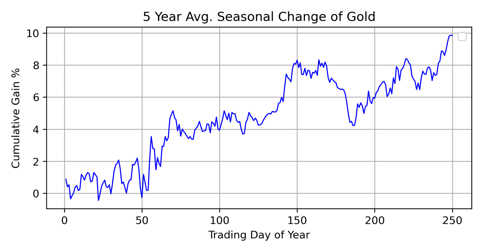
Perhaps I was mistaken. There certainly does appear to be some sort of a spike around the 150th trading day of the year. This is not enough to actually base a trade off of, but it’s something worth noting. If one was bullish before this spike, it would give him an extra boost of confidence to actually place his trade.
However, we should keep in mind the time period in which this data is taken from. 2019 through 2024, saw the COVID era. We should expect these markets to reflect some of those anomalies which occurred.
Which brings us to our next graph. This one evaluates the S&P 500. Perhaps you’re familiar with the old adage, “Sell in May and go away.” Let’s see if they are right.
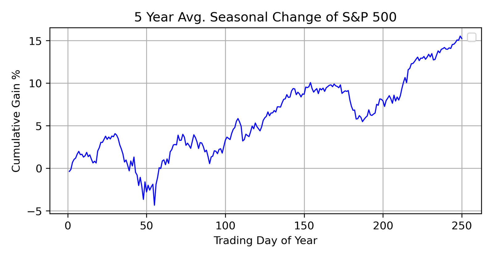
Well, in a world of free money and low interest rates, I’m not sure the old saying is good advice. There certainly seems to be some sort of a downturn towards the first part of the year, but I believe most of that is the market crash we experienced during the COVID lockdown. Since we’re only averaging five years, such a black swan event has a heavy draw on the overall outcome.
Okay, so we can see this methodology is working pretty decent, but we’ve yet to find a market with true seasonality within it. So let’s stop messing around and actually go to the grain markets. Corn should possess some sort of seasonal tendency, and it should be very evident. Let’s see if that’s true.
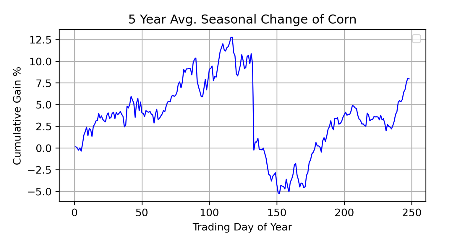
Wow!
That right there is what we’re looking for. Now here’s the amazing thing. When I look back at the seasonal tendency charts for corn published by Larry back in the 60s and 70s and the latest ones published by the Moore Research Center, they all show the exact same thing that I’m showing here. There is something which goes on in mid-summer in the corn market that significantly influences the price. I believe it would be rather difficult to hold a long position before the large dip going into August.
So there you have it. There is some seasonal tendencies in certain markets. I believe any commodities trader would want to be in line with these seasonal tendencies and not try to fight against them. And yes, there are other commodity markets I tested. In fact, I would invite you to go investigate what happens to crude oil and gasoline in the month of October.
Jonathan Adams
August 1st, 2025